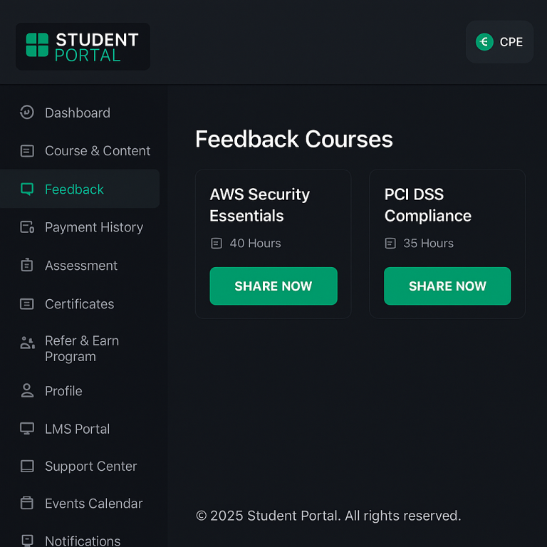
Light Theme: Use a pale neutral background (white or very light grey) for the main interface to keep the look clean and calm. Accent colors (e.g. blues or greens) can signal trust and success, while a single vibrant hue (orange, yellow, or green) is reserved for primary actions (buttons or highlights). For example, the screenshot below shows a white background with a light gray sidebar and a bright orange Share Now button. Studies of educational sites recommend ~60% white/neutral base, ~30% softer secondary color (e.g. blue or green), and ~10% bold accentb verpex.com . Blues are very common in academic UIs (calming, trust) verpex.com; combining shades of blue on white yields a balanced, professional look bootstrapdash.com. DodgerBlue (#1E90FF) or other medium blues appear cheerful on white bootstrapdash.com. Keep text dark (black/gray) for readability. In mobile-responsive versions, UI elements should scale (e.g. collapsing side menus) and buttons remain large enough to tap; many modern templates (like Stellar Admin) use a mobile-first, responsive design approach bootstrapdash.com.
Figure: Example of a light-themed student portal UI. A white card background and pale gray sidebar keep the interface airy, with a vivid orange CTA button. Neutral colors dominate and one bright accent color stands out for action. Above, the main page titles use clear sans-serif fonts (e.g. Open Sans) and ample white space is used to reduce clutter.
Dark Theme: For dark mode, use very dark greys (not pure #000) for backgrounds. Material Design advises surfaces around #121212 rather than black to reduce eye strain uxplanet.org, with text in near-white (about 87% opacity white uxplanet.org). Avoid oversaturated colors on dark backgrounds (they may “vibrate” visually); instead use desaturated or lighter-toned accents (e.g. green-200 or blue-200) uxplanet.org. Use high contrast: test text/background with WCAG guidelines (aim ~15:1 for black-and-white). Accent colors (like bright green or yellow) can pop on dark grey. For instance, the Stellar Admin template pairs a charcoal background (#181824) with a vibrant green (#38ce3c) accent, plus warm rose and yellow highlights bootstrapdash.com. This gives an authoritative but lively feel: blacks and dark grays provide “serious” base, while one vivid color draws attention desantisbreindel.com bootstrapdash.com. In practice, let users toggle modes; ensure your dark theme is not just an inverted light theme but thoughtfully adjusted for contrast and mood uxplanet.org.
Minimalist (Flat) Style: Modern student portals often use a minimal flat design. This means very few colors and plenty of whitespace. A typical scheme might be one or two shades of a color family on a white/gray base. For example, the Azia dashboard uses just fuchsia and aquamarine-blue on white bootstrapdash.com, creating a simple yet serious look. Similarly, Skydash uses two blues and a touch of pink on white bootstrapdash.com. The idea is to limit hue variety: use neutral grays (light #F9FAFB, medium #6C757D, etc) for most UI surfaces verpex.com, with color only for key elements. Follow the “60‑30‑10” heuristic: ~60% background neutral (white/light gray), ~30% one secondary color (blue or gray), and ~10% bright accent. Large, legible sans-serif fonts (e.g. Roboto or Open Sans) and simple icons reinforce the minimal feel w3schools.com.
Vibrant (Multicolor) Style: For a more dynamic, energetic look, mix several bright colors on a neutral canvas. In a “vibrant” theme, the background is usually white or very light, and different colors highlight different data or actions. For instance, the Pollux UI palette uses a bold purple (#844fc1) as its primary accent, with green (#21bf06) for success indicators and blue (#3b86d1) for navigation highlights on a white #F8F9FA background bootstrapdash.com. Breeze Admin is another example: it keeps a mostly white/grey interface but adds colorful charts/icons in pink, yellow, purple and green bootstrapdash.com. The key is balance: let one bright color dominate each component (so text/icons pop) and use pale grays (#6c7293, #f8f9fa) to tone it down bootstrapdash.com. Vibrant schemes work well for progress bars or statistics where multiple statuses are shown. Always include enough neutral space so the screen doesn’t feel chaotic bootstrapdash.com.
Branding and Popular Palettes: Use the organization’s brand colors as your primary palette base. Many tech/company portals draw inspiration from well-known brand schemes. For example, Google’s logo palette (blue #4285F4, red #DB4437, yellow #F4B400, green #0F9D58) creates a playful, diverse look usbrandcolors.com; Microsoft’s segmented palette (orange #F25022, green #7FBA00, blue #00A4EF, yellow #FFB900) is bold and distinctive usbrandcolors.com. In general, blue hues are pervasive in tech branding (over 50% of tech logos use blue or black desantisbreindel.com) because blue conveys trust and stability. Some brands use a multi-color (rainbow) approach to feel creative (e.g. Google, eBay, Microsoft) desantisbreindel.com. Others use a neutral base (black/gray) with one bright accent for edge (e.g. Slack’s black/orange, or Nintendo’s black/red) desantisbreindel.com. When designing a portal, use the company’s primary color for major highlights (headers or buttons) and a secondary color for accents, matching guidelines like Material’s recommendation of a primary and secondary theme color mdc.almoamen.net usbrandcolors.com.
Popular schemas include:
Facebook/Meta blue (#4267B2) on white usbrandcolors.com;
IBM blue (#054ADA) on light gray;
Amazon orange (#FF9900) on black;
Apple’s minimalist grayscale (black #000000, gray #555555) usbrandcolors.com.
These palettes give a familiar, trust-worthy feel if appropriate for the audience.
Responsive Design (Mobile vs Desktop): Ensure colors work at any size or environment. On mobile, screens are smaller and may be used outdoors, so you need high-contrast text and buttons. Use large, solid-colored CTA buttons (60px+ height) in your accent color so they are easy to tap. Collapse sidebars into hamburger menus or bottom navigation on narrow screens. Many modern admin templates are mobile-first, meaning they adapt layout and color usage for smaller devices bootstrapdash.com. For example, if your desktop sidebar was dark gray, you might simplify mobile navigation as a top bar with the same color. Dark mode is especially useful at night or in low light; provide a toggle so users can switch, and consider using warm accent (orange/teal) in dark mode for readability uxplanet.org. Always test color contrast on real devices and consider ambient lighting differences (matte vs glossy screens can affect perceived brightness).
Navigation, Bars, Cards, and Buttons: Follow a consistent role for each UI area. Sidebars/drawers often use a solid background to distinguish them: either a neutral (light gray or dark gray) or the primary brand color. Material guidelines note that it’s acceptable for a navigation drawer or app bar to use the primary color to reinforce branding mdc.almoamen.net. For example, you might make the top header bar your main blue brand color, or keep it white with colored icons. Cards and content panels typically use white or very light backgrounds mdc.almoamen.net so that text and charts remain highly legible. Call-to-action buttons and key controls should use the accent/primary color to stand out. Material suggests using your primary color for most buttons and your secondary for floating actions mdc.almoamen.net. For instance, the “Submit” or “Next” buttons could be bright blue (#2196F3) or orange (#FF5722) on white. Always ensure button text contrasts (white text on blue/orange is common). Use subtle shadows or color contrasts to create hierarchy: hovered/active buttons may darken slightly. Icons or active menu items can also use an accent color (blue or green dot) for clarity. In summary:
Sidebar/Top Bar: neutral or brand-hue background;
Cards: white/light;
Buttons/Links: your bold accent color (primary or secondary) with white text mdc.almoamen.net.
Font Pairings: Choose clean, readable fonts to match your color scheme. A sans-serif for body text ensures clarity (e.g. Open Sans, Roboto, Lato, Inter).
For headings or logos, you can pair a serif or display font if you want contrast. Popular combos include Merriweather (serif) for headings with Open Sans (sans) for body w3schools.com, or two sans fonts of different weights (e.g. Oswald for headings, Noto Sans for text w3schools.com). Keep line spacing generous, and use dark text colors (#212121 or #333333) on light backgrounds. For dark themes, light text can use near-white (#E0E0E0) to reduce glare. Limit font families to 1–2 so the UI feels cohesive. Consistency between desktop and mobile typography is key: test on real devices to ensure legibility (24pt+ for titles on mobile, ~16pt for body).